Tautologies and corruption aside, I decided to finally go look at the data myself-- what exactly are they on about? It took me about five minutes to figure out at least part of what is going on.
The Stock Market
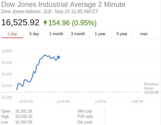
Before I get to the data, let me use something everyone is familiar with-- the stock market-- just to set the stage. Take a look at this one day chart of the Dow Jones. Holy crap, the market is really moving up!
Ok, what about if we "zoom out" and look at the five day chart?
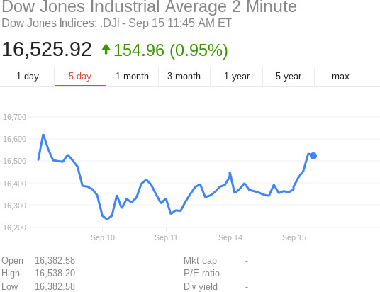
Huh, this paints a different story! It was up, then down a bit, now rising again. What if we "zoom out" again and look at the big picture?
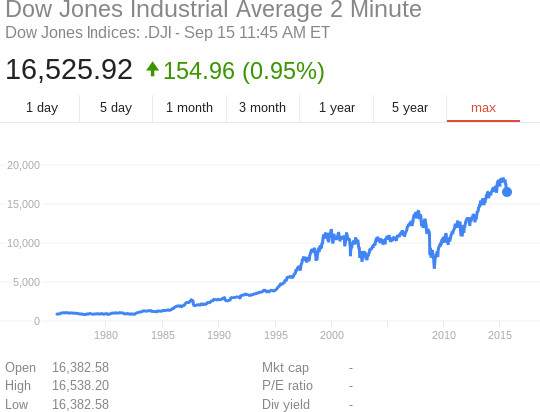
Ahhh, now we have perspective-- the complete portrait! The market went up, then down, then up, then down, then rose a bunch, and is now going down just a bit. The overall trendline is unmistakably "up".
In conclusion then, depending on how you zoom the charts in and out, you get a completely different picture of reality.
The Earth's Temperature
I am going to show a few charts of the Earth's estimated temperatures over time. These charts are linked directly from Wikipedia, a site which if anything has a Statist/liberal bias.
The first chart is the equivalent of the Dow's "one day" graph, and it goes back to 1880. 1880 might sound like a long time ago, but remember, the Earth is a lot older than the Dow Jones stock market, to the tune of, oh, 4.5 billion years; 135 years is like a molecule in a grapefruit! So I think it's fair that we equate this to one day of the stock market.
And holy toledo, even when you notice that the temperatures have flat-lined for the past fifteen years, this still looks really bad-- when I first saw this, I thought "the alarmists are actually on to something!"

So what about the equivalent of the "five day" graph?
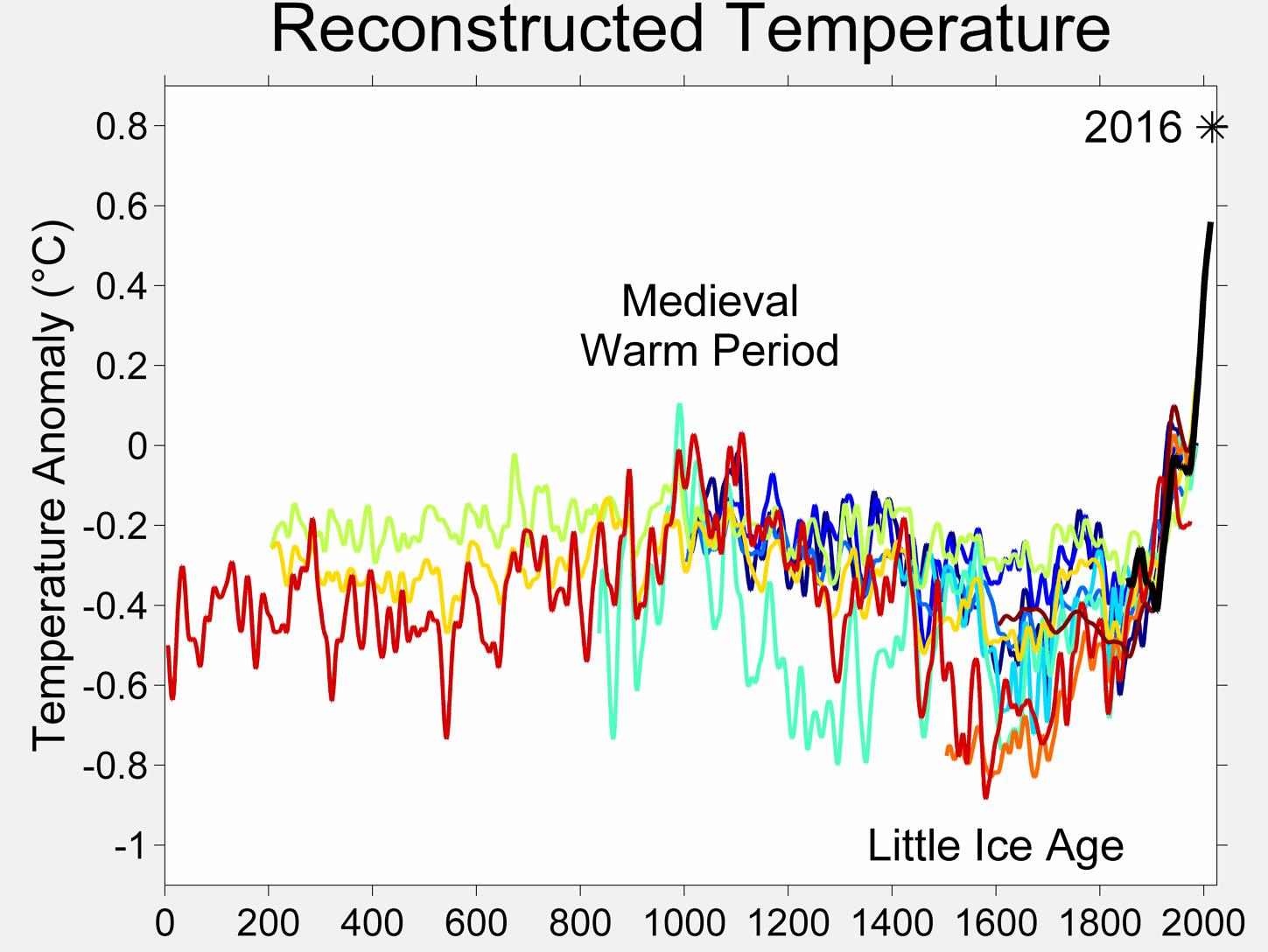
This still looks bad, but there was also a very similar looking period during Medieval times, and last time I checked there weren't too many smoke-belching factories or stinky automobiles around then. So, what about the big picture?

Ahhhh, some perspective, at last! Looks like a wobbly, downward-trending line to me.
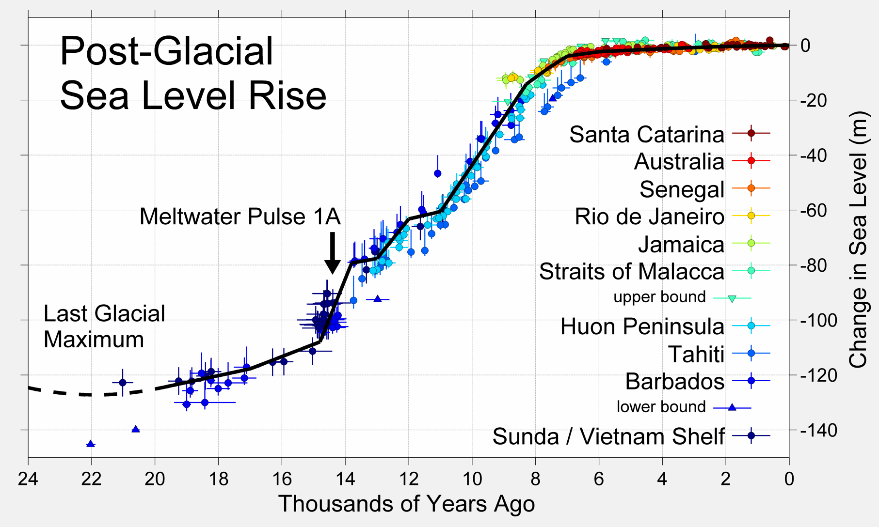
Sea Levels
Following the same pattern, here is the "one day" chart of the Earth's sea levels. Eek, looks bad!:

But then you "zoom out" to gain some perspective, and the line looks pretty flat for the past 8000 years...
Conclusion
The Earth has had warming and cooling periods for its entire history, long before man had factories or automobiles. But it isn't until you "zoom out" and get a holistic picture before you can appreciate that fact.
Sea levels paint a similar picture; like in any graph, there is lots of noise if you zoom in, yet the trend is very slowly upward, and has been for 8000 years.